Less Complicated Than Simple
David Cauchi
29 October 2023 – 28 January 2024
PAINTINGS AS FOUR-DIMENSIONAL OBJECTS
A conversation between Laurence Simmons and David Cauchi
LS: Your painting deliberately crosses a line between cartooning and painting. The works have a comic book sensibility. However, there is a difference between your adoption of comics and, say, Roy Lichtenstein’s almost mechanical reproduction of images as they appear in comic books. How do comics help us better understand your paintings?
DC: Comics and cartoons share the same means as painting but have a different language and history. It’s a visual language that people grew up with and understand. I grew up reading Asterix and Tintin, and 2000AD a bit later, in that heroic early 80s period it had. I wasn’t into American superhero comics so much.
Despite their differences, there are obvious crossovers between painting and comics — from early Gothic paintings with speech bubbles and Renaissance paintings with sequential narratives (such as Piero’s Death of Adam and Masaccio’s Tribute Money) to modern painters who adapted cartoon forms and adopted cartoon methods, such as George Grosz and Philip Guston.
I’m interested in cartoony simplifications of form — a simple outline, flat areas of unmodulated colour, schematised forms — and comic book solutions to representing movement and sound. The tools cartoons and comics have developed over time are really effective, so I use them.
I’m not that interested in sequential narratives. I like my pictures to stand alone. I tried doing a graphic novel once (which involved Piero, Picabia, and me time travelling) but lost interest after doing a first draft.
LS: All your paintings are in a drawn line and painted wash style, and in some way they explore the relationship between drawing and painting. Is there a process to your painting: pencil lines on a white background then filled in with thin paint in quick dabs? Do you start out with a plan? How is the process part of your message?
DC: I’m not one of those people who develop their ideas about a painting while they paint it. I like to work everything out in my head first, develop a very firm mental image of what the finished picture will look like.
Drawn outlines enclose flat areas of not necessarily naturalistic colour that I build up in layers of first watercolour and then oil glazes. Piero della Francesca defined painting as line and colour on a flat surface. I like to give equal weight to each, and I think the interaction between them can be very productive.
Because the layers are transparent, I plan how the first layers will interact with later layers. You can see each stage of the process at once, like collapsed time. I like to think of paintings as four-dimensional objects — they are the traces of a series of movements through
space over time.
This very much ties into the idea of simplicity. Show your workings, as they told us to do in Maths. First and foremost, the picture is a picture. It doesn’t hide what it is. And simplicity is not just a good thing in art. The best mathematical proofs are what they call ‘elegant’. They are as simple and clear as they can be. It’s the same in philosophy. Occam’s razor is the
principle that a simple explanation is more likely to be correct than a complex one.
I want my pictures to have that same kind of elegant simplicity. Once again, it’s about effectiveness. Line and colour on a flat surface.
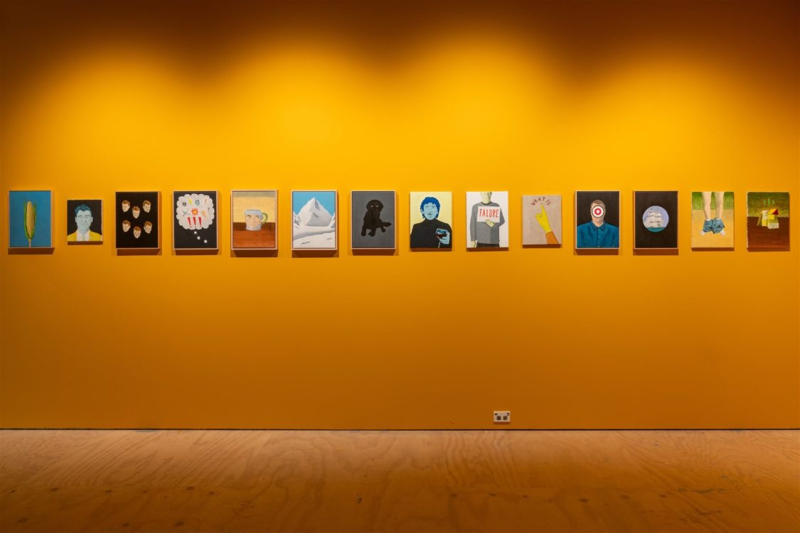
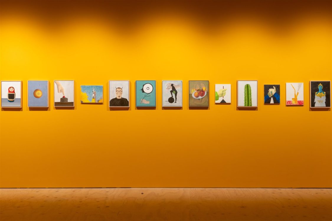
LS: All your paintings and drawings are more or less the same size. Why is that so?
DC: There’s a lot to be said for large paintings in large spaces, not least the immersive experience of standing in front of them, but I prefer to paint for domestic spaces on a human scale. My paintings are all roughly about the size of a human head, and I like to think that standing in front of one of them is not a million miles away from standing face to face with someone you’re having a conversation with.
We’ve evolved as a highly social species, and all sorts of things go on in your head when you face someone and interact with them. I like to imagine that people can have the same kind of benefits from a conversational relationship with my pictures. This is just fairly self-indulgent wishful thinking though!
When I’m planning an exhibition, I might have a vague theme tying the pictures together, but I don’t like to be too rigid about it. I like to have a variety of content in my pictures, and I don’t want to be too restricted in what I can do. Repetition and seriality are good in timebased media such as music and film but not so much in painting, not as a dominant element anyway. If I go to a show and every picture is some slight variation on the same idea, my heart sinks. Keep that shit in the studio.
But, by the same token, I want my paintings to be cohesive, to work together, no matter the subject. So I make them all the same size, and use similar centralised and balanced compositions and a similar restricted palette. It also adds a bit of rigour.
LS: When I looked through the list of works for the show your use of colour jumped out at me. There is a sort of impartial delight in the way you apply colour to the canvas, like the way a child might blurt out ‘Hey, look at that fat guy!’ You are a connoisseur of yellow (Direct your hate here (2011)) and green — notoriously difficult colours to use. Green predominates in Legless (2017), Gherkin (2016), Cactus (2020), as well as the repeated presence of a sickly green complexion. And a sort of alien-from-space-like blue surfaces in Athena (2021), Visitor (2017), and Lifeline (2017) and numerous other pieces of depicted uniformlike clothing. How do you choose your colours and see them working?
DC: I usually work on several paintings at the same time, using the same palette of colours for each. This helps them to work together as a group, even if they have quite different subject matter. I like to use a limited palette, just a few primary and earth colours.
For a while, I used just pure colours. I still tend not to modulate my colours too much. I’m very distrustful of it, that dodgy 17th century innovation of mixing your colours with white and black. I set the tonal qualities with the underpainting, first in monotone, then in a couple of earth colours and green. I then glaze layers of local colour over the top of that.
My colours are not naturalistic. They have more to do with the construction of the picture as a whole than any particular thing they’re depicting. If they do have any relation with what they’re depicting, it’s metaphorical. They bring their own associations to it.
I’m quite a fan of all those mad symbolic colour systems people like Goethe came up with. I don’t have any kind of system myself though. It’s much looser than that. It’s just whatever works for that particular picture.
LS: You are a painter of verbs, of people dancing, reacting, working at something, full of pep. Your figures project speed and immediacy but they are not just hieroglyphs. In your painting, there exists the sensation of an image arrived at through careful in-the-moment looking. How do you find your subject matter? Is it simply whatever catches your eye or do you research a topic before setting out to paint it?
DC: I’m always on the lookout for subjects for paintings. You find them everywhere, in all sorts of odd places. Whether they’re any good or not is another story. My partner Rose is always saying to me, ‘No, David, that’s not a good idea for a painting.’ (Though she is sometimes known to say, ‘That’s a great idea for a painting!’)
Sometimes I’ll think something is a good idea, then spend quite some time reading up on it, finding an angle, a pithy way to show it. This can go nowhere. I just can’t resolve whatever it is into a picture that works and that looks good.
Other times, I’ll just come across something that jumps out at me, whether it’s an image, an idea, a visual joke. Sometimes, these arrive pretty much fully formed, and I just need to sort out the details. More often, they’re the start of a chain of associations that I need to work up into an image.
I depict metaphorical objects, and relatable everyday objects make the best metaphors. A picture exists in the intersection between the object’s physical characteristics and the viewer’s unique interpretation of those characteristics. The artist’s interpretation is no more important than anyone else’s.
What I hope my pictures do is prompt a series of associations in the mind of the viewer. The more the merrier.
LS: Your painting looks figurative with a directness — an everydayness — and yet I feel that there is also an abstract dimension to your work. You use line, colour, surface to represent objects and forms that belong to our recognisable world but I have the sensation that use is driven by an almost mathematical and abstract sensibility.
DC: The French have a saying ‘as stupid as a painter’. They also have a genre of pictures portraying painters as monkeys. Both come from the naïve idea that the painter reproduces the visual sensations of whatever is in front of them in an instinctive or mechanical way, without reflecting on or analysing it in any way. This idea is based on an assumption about how perception works that’s still current — in the modern metaphor, the eye is a camera, memory is a video, passively recording what is really there.
But all figurative paintings — from the most stylised to the most naturalistic — are constructed according to a set of conventions for representing objects and the space they occupy. These conventions determine the various ways of arranging lines and colour on a flat surface to represent various objects. Kids’ drawings all look so similar because they scarily all somehow come up with the same conventions to represent people, the ground, trees, houses, the sun.
And it’s the same with perception — our brains construct our experience of the world out of the electrical signals they receive from our senses. They translate those signals into representations and order them in such a way that they form a coherent world. But that order, that coherence, is imposed by the brain. It’s not a feature of the external world, whatever that may be. The world we experience is fundamentally unreal. It’s a construct.
As well as this world of appearances we experience, we inhabit a multitude of conceptual worlds. Some of them are private and individual. Others are shared and social. In a certain sense, painting is a way of bringing these private worlds into a social world.
I’m not interested in reproducing the visual sensations of seeing something. I’m not into illusionism or virtuosity. I want to portray the conceptual worlds we construct in our heads, and I want to foreground that they are constructions, conventions.
So I use simplified forms, prominent outlines, flat areas of colour to depict isolated objects in ambiguous spaces — each painting a fragment of a disassociated fractured world. Occasionally, I’ll also use visual conventions from outside of art, graphs, diagrams, signs, maps.
The main thing is that a painting is not a picture of something. It is a thing. It is a construction of various pictorial elements that operate together to form meaning.
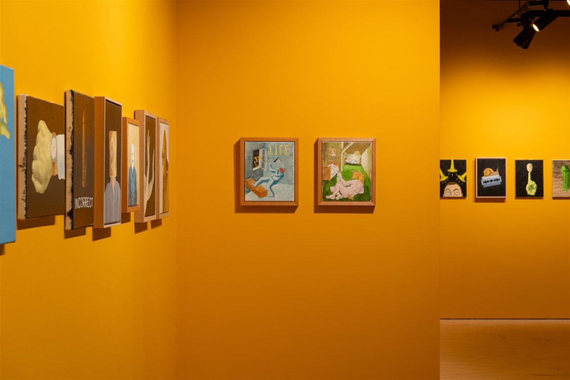
LS: I detect a certain anxiety behind your paintings. There exists a tension behind the self-portraits; as if, performing an eternal ‘selfie’, you seem to be looking anxiously for your own face, the one you can’t find in the mirror: you have put yourself behind bars as a criminal (The prisoner, 2016), placed a bottle on your head (Balancing act, 2018), painted six of the self all looking in different directions (If one is good, then six are better, 2017), negated yourself by crossing out your own image (No self-portrait, 2012), and even engaged in self decapitation (My head on a plate, 2016)? Why have you returned to paint yourself in this way so many times?
DC: In a trite way, every painting is a self-portrait. It reveals the person who made it. The subject they chose, their way of handling it, their touch. So I thought I’d make this explicit, play around with it a bit, take on different roles, play various characters in various situations, characters that reveal and conceal.
As Baudelaire said, ‘Multitude, solitude: terms equal and interchangeable for an active and prolific poet. People who don’t know how to populate their solitude also don’t know how to be alone in a busy crowd. The poet enjoys this incomparable privilege — they can be themselves or whoever else grabs their fancy.’
There’s no such thing as a unified self, rather a conglomeration of competing selves that form the illusion of an ‘I’.
Each of us is an embodied consciousness inhabiting the world. We have to make sense of, and interact with, that world and each other. I’ve only got my own experience to go on, and the different roles the self-portraits take on are different aspects of that experience. Hopefully, people can relate.
There’s also the very practical aspect that I’m always available as a model, and I don’t have to explain what I want. And it’s fun working out how I’ve got older since the last one. A few more lines here, a bit more sag there.
LS: Many of your paintings are full of hands: a pointing hand (What is, 2009), a hand solarised by rays of strong sunlight (The invisible hand, 2014), a hand grasping and dragging a pencil (The line, 2013), a hand thrust up out of deep blue water ‘gasping for air’ and causing concentric circles to ripple (Lifeline, 2017), a hand poised to catch an apple (Still life with apple, 2017), an upright hand snapping its fingers (Snap, 2018). There is something uncanny about the painter’s hand that paints a hand, or borrowing one’s own painting hand as a subject. What draws you to depict the hand?
DC: Hands are so expressive! In the Renaissance, there were codified meanings for certain gestures that everybody understood. These were originally developed for itinerant preachers so people in the back of the crowd who couldn’t hear very well could follow what was going on.
Renaissance painters cheerfully adopted this language of gestures. Their figures are conveying a whole layer of meaning with their hands that the original viewers would’ve got and that we are missing out on. Specific emotions, specific concepts. But our culture has a set of codified gestures too, and I like to isolate them, strip them of context, focus on them.
As well as being expressive, hands are the main way we interact with the world, with things outside of ourselves. I like the idea of hands reaching out into pictorial space, interacting with it. It’s what we’re doing with painting after all.
LS: Doorway (2019) is an internal space in the Renaissance painter Piero della Francesca’s house in Sansepolcro. Cauchi contra mundum (2001–11) is a large drawing in the form of an altarpiece with predella, the centrepiece based on Piero’s Resurrection (Museo Civico Sansepolcro, 1467-8). Piero is an important reference point for you. What attracts you to Piero as a painter and attracted you to his images in particular?
DC: There are the usual things that are always mentioned: the cool clear colours, the harmoniously balanced compositions, the geometric simplicity, the otherworldly stillness.
But more than anything else it’s his visual solutions to the problem of how to depict abstract concepts. For example, in The Resurrection, which is a fresco reasonably high up on the wall of what were the council chambers of his home town (where judgements
were also carried out), everything is seen from below:
the tomb, the soldiers sleeping in front of it, the landscape — everything, that is, except Jesus, who is depicted straight on.
Piero has done this to show that Jesus doesn’t care how high or low your position in society is. He confronts everyone head on, stares everyone in the eye, and judges everyone the same.
Piero’s informed many of my general stylistic choices, the abstracted conception of form, the rigid compositions, the cold surfaces, the distance. And lots of my pictures have direct references, which is just another way of saying I’ve ripped off heaps of figures and objects from his paintings. Like heaps.
I’ve even ripped off an architectural feature of Piero’s house, which he designed himself. What I particularly liked about this doorway is the way the steps are both cut into the wall and come out in front of it. It struck me as a great encapsulation of pictorial surface and depth, out from and into the picture plane.
Two common metaphors for painting are windows (for figurative paintings portraying a fictive space) and walls (for abstract paintings that are all about activating the surface). This doorway in Piero’s house seemed to me to combine both metaphors, to be both window and wall.
After being neglected for centuries, Piero was championed by early 20th century modernists, who saw him as an important precursor to what they were doing. I hope my picture of his doorway has a similar combination of surface and depth. Form and content working together.
LS: You have described Francis Picabia as ‘the best artist of the 20th century, much maligned and hard done by art historians’. How has Picabia influenced you?
DC: Picabia is not really a stylistic influence. It’s more of an attitude thing. Picabia was all about freedom, especially artistic freedom, which is always under attack. He was utterly opposed to authoritarianism in all its forms. He mocked all the self-serving hypocrisies and lies people tell themselves and each other, and his work questioned and undermined some of art’s most fundamental assumptions.
Picabia changed styles a lot all through his life. He started off as a post-impressionist, before moving quickly through fauvism and cubism to develop his own form of abstract painting, complete with its own theory: amorphism.
One of my mad theories is that Picabia and his wife Gabrièle Buffet invented abstract painting together. Other people had painted abstract paintings before, such as Hilma af Klint and Kandinsky, but there was a crucial difference. They were painting depictions of what they believed was an underlying spiritualist/Theosophist reality. I reckon that makes them realist painters.
Picabia and Buffet’s theory was much more like what we consider abstract painting to be. It’s about painting forms that are completely divorced from observable reality. If they represent anything, it’s the painter’s internal state. When the poet and champion of cubism Apollinaire couldn’t get his head around a painting that doesn’t refer to the material world at all, Picabia used the example of the triangle, an abstract form that only exists in maths, not as an object.
These ideas came from Gabrièle Buffet, who was a very advanced musician. She made the connection between the latest musical theories and the painterly concerns Picabia and his mates were talking about (this was 1908, 1909). Music is an art form that’s inherently abstract, after all.
Picabia presented amorphism as a joke, then immediately ditched it for a new idea: the mmechanomorphs, the machine as a metaphor for modern life, which he developed with Duchamp. These were then adopted by the Dada movement.
Picabia was the chief protagonist of Dada’s nihilist wing. Roughly speaking, Dada had two factions, art and anti-art: the constructivists, who wanted to tear down the old systems to replace them with their own systems, and the nihilists, who distrusted all systems, because of their very nature. Picabia mocked everything equally. mAsked what he and Picabia believed in, Duchamp answered, ‘Nothing, of course!’
Picabia was always taking the piss, not just in his Dada work but right from the beginning. His early post-impressionist paintings mocked plein air painting. They were way too huge to have been painted outdoors, and they were based on postcards. Postmodern appropriation in the 1890s, people. Appropriation is one of the threads that run through all Picabia’s work, no matter the style, and he published a significant defence of it in the early 20s.
After Dada, Picabia buggered off to the South of France, where he kept inventing new styles and having a laugh. For example, in the 30s (when he was in his 50s), a series of paintings he called the transparencies replaced traditional perspective with images superimposed on each other, as the cinema replaces one photo with another in rapid succession to give the illusion of movement. These were all a tangle of overlapping lines and a wondrous complexity of glazes. And even the term ‘transparencies’ was a joke.
Picabia kept this up right to the end. His last paintings baffled people when they were first shown. They were groups of small circles of colour against a uniform background, heavily impastoed, and no-one could understand why.
I’ve been into Picabia since I read about him in Hans Richter’s memoir Dada: Art and anti-art when I was 15. At that time, he was considered a very fringe figure, just a joke, but I was lucky enough in those pre-internet days to find a good book by Maria Lluisa Borràs that had all his work, not just the Dada stuff. It blew my mind.
Now everybody’s into him, and he’s considered a major figure. I kind of feel like one of the original fans of an obscure underground band that’s been taken up by the mainstream.
LS: Your paintings are silent, taciturn, and yet they are full of the presence of sound: the clang of a bell (Obsidium generis umani, 2011), the rasp of a striking match (Spark, 2014), the blaring of horns (Self-portrait with horns, 2016), the ring of an old-fashioned telephone (Off the hook, 2016), the crackle of radiowaves (Radio Free Malevich, 2016), a gunshot (Smoking gun, 2018), and the artist’s scream (Scream, 2017). There is no quiet here. It seems implausible that painting should depict sound like this.
DC: These are all different ways of portraying something non-visual, sound, through visual means. In some cases, such as Spark or Smoking gun, the sound is almost incidental. The main thing is arresting the sudden moment in time when everything happens, that flash, that moment of realisation, of heightened experience.
But I also like the idea of pictures that portray sound even though it’s absent. The pictures are silent, and the viewer provides the sound. It’s an imaginary sound that only exists in their head.
I didn’t deliberately go about doing several pictures about sound. It just sort of happened. This is one of the things I like about making paintings. You spend all this time with a work while you’re doing it, then someone else comes along and points out something you hadn’t really thought of.
LS: Your paintings are witty and associative but there is also an element of dark humour and rebelliousness in your painting, and you have described yourself as ‘a common-sense nihilist’. How does nihilism help us to get a grip on your work?
DC: In responding to the absurdity of the world, surely it’s better to laugh than cry! It’s certainly more fun. I mean, not to be too wackadoodle about it, but obviously nothing exists and there’s no meaning or purpose to anything. Obviously.
We project meaning on the world by perceiving it, conceptualising it, interacting with it. It’d just be formless chaos without us to make sense of it. That’s just common sense, right? Painting replicates this process. The viewer invests meaning into an arrangement of lines and colours on a surface in the same way they invest meaning in the world. The act of observation creates observer and observed. Form and content working together.
Whatever happens in a painting takes place, almost by definition, on the surface. And yet there is something obscure and enigmatic about your work, some secrets that are withheld. I sense a hidden depth. Do you see yourself as seeking out subjects that deliberately convey a kind of mystery?
There are several subjects I keep on somewhat obsessively returning to. One of these is the occult, the hidden. It’s about imparting and withholding information at the same time.
I really like the visual conventions tarot cards and alchemical drawings use to encode information symbolically. Most of it is there, this thing stands for that thing, but some of it you have to supply yourself. You need to complete it in your head. And you don’t really need to know what the symbols represent to do it.
I want my pictures to work the same kind of way. You don’t need to know the references, though it can help. You just need to engage, bring your own perspective and experience to complete it in your head.
LS: Bringing together so many works like this illustrates their diversity — we engage in a sort of pictorial channel-surfing — but it also suggests their similarity. Can your works be said to speak to each other? Do you see them as ‘speaking the same language’?
DC: I’m wary of thinking about painting as a kind of ‘language’. Language is a symbolic structure with highly specific rules for putting words together to form meaning. Many of these rules and whole sets of words don’t refer to anything outside of themselves. They only exist to make sentences work. Painting isn’t like that. It works differently.
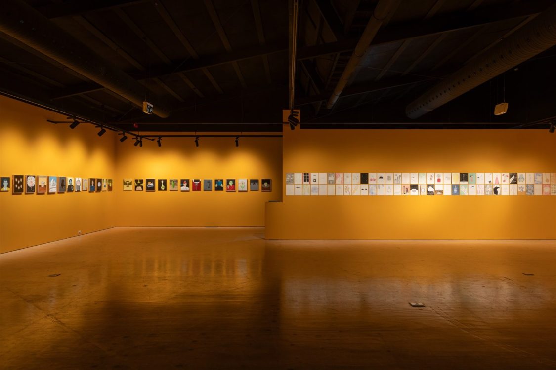
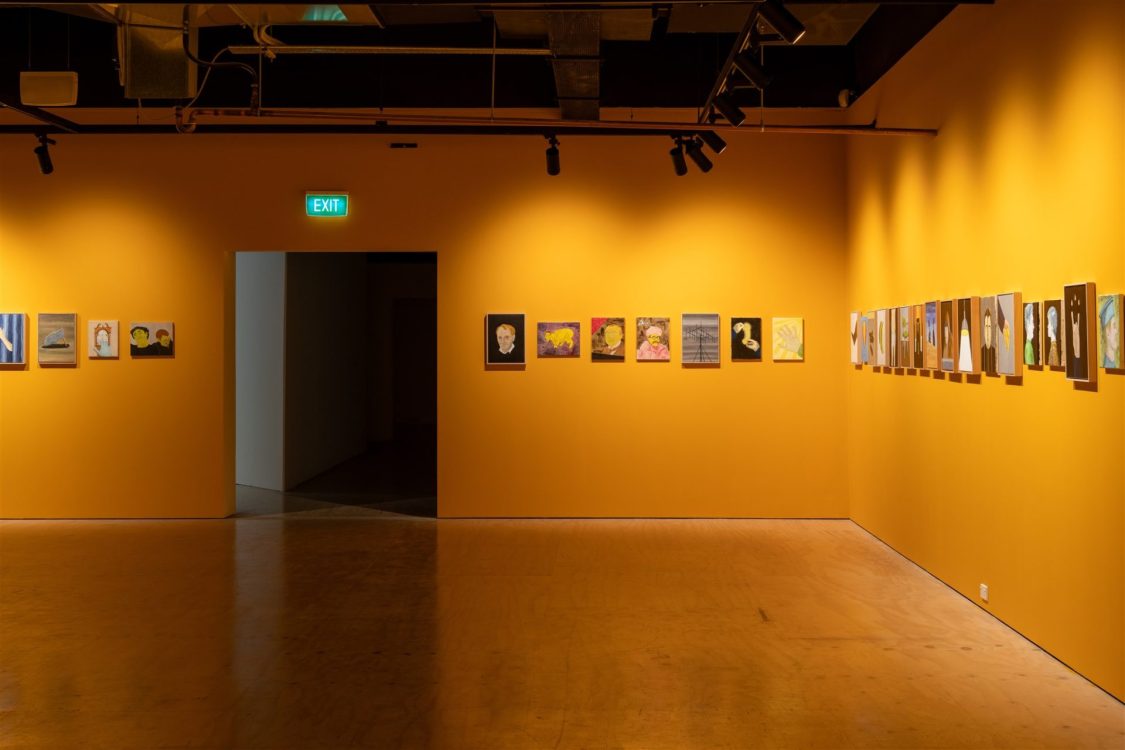
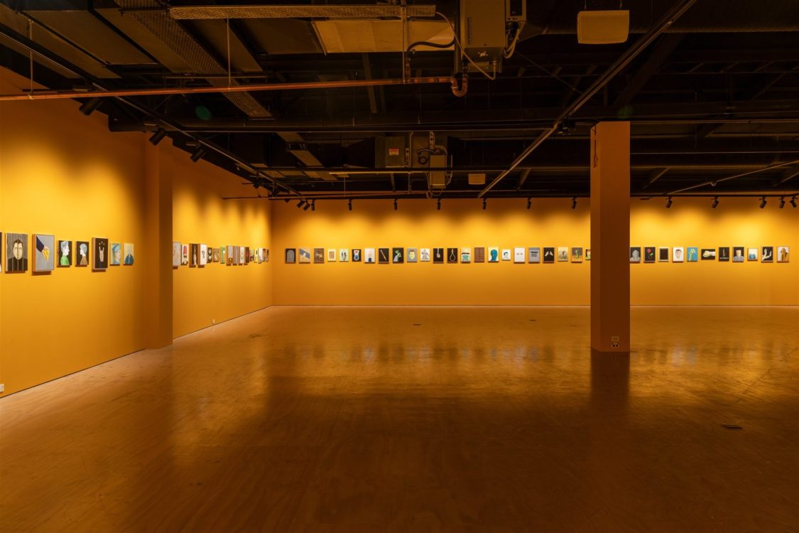
It’s quite weird, this thing of showing a whole lot of work together. I usually show about 12 paintings at a time. Each painting needs to stand alone, but they also have to work together. To help do this, I use formal means: they are all the same size and format, they share a similar colour palette, and they are centralised, schematised, and isolated forms against a uniform background.
I also have several repeating motifs, subjects, themes. Things that nag at me and that I keep on coming back to. The things that obsess me.
LS: The titles of your paintings work to make a cliché or signage resonate into a surprising image. In your titles, I detect the hand of a master ironist who manages to convey the subtle relationship between mockery and imagination. The directness and simplicity of what is being said reverberates with the wackiness of what is being depicted to evoke a wry feeling of affection. How important is the ironical mode for you?
DC: I spend quite a bit of time making sure a painting’s title is right. It’s an important element. In a way, it sets the parameters for considering the picture. It’s a springboard.
But, most importantly, the title is a verbal element that stands in direct relation to the picture’s visual elements. This has lots of possibilities for wordplay.
More generally, irony has a lot of the same characteristics as the painting I like. It has a distance, a cool detached eye. It allows us to analyse things in a way that doesn’t have the limitations and biases of logic and scientific rationalism. It’s against systems. It’s open-ended and wide-ranging, not narrow and closed. It has a certain slipperiness.
Irony doesn’t lecture or berate you, just whispers in your ear, teases you a little. It gets in some sly digs. And, crucially, it needs the viewer to be an active participant.
Irony might not be cool right now, but I don’t care. It’s the mode I’m most comfortable in.
LS: While your painting does not directly address climate change and the future we are recklessly propelling ourselves towards I detect a sense that this is what impels you to paint?
DC: The climate collapse is very much what impels me to paint. It’s much more full on and happening much faster than anyone really expected. Though I get the sense that
the climate scientists with the best idea of what’s going on play down how completely screwed we are.
We’re in this completely crazy situation. We know what’s going on and what we as a species need to do to mitigate it — there’s no stopping it — but we’re not doing it. Fossil fuel use and meat consumption are going up, not down.
Historically, the concept of posterity has been very important for painters. That’s who you’re painting for, not the ephemeral society you live in. But for the first time in history we can’t count on posterity. We can’t be sure there’ll be future generations to talk to. And if there are, they’re going to hate us.
The only thing to do is paint for now, as a way of getting to grips with all the contradictions of a collapsing society, to portray a fragmented disassociated world that has never made sense but makes even less so now as it’s falling apart.